So I did another similar Italy painting to one I had done a while ago except it has more blue hues to it than the other.
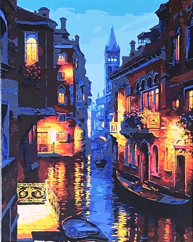
Again these look much better from far away.
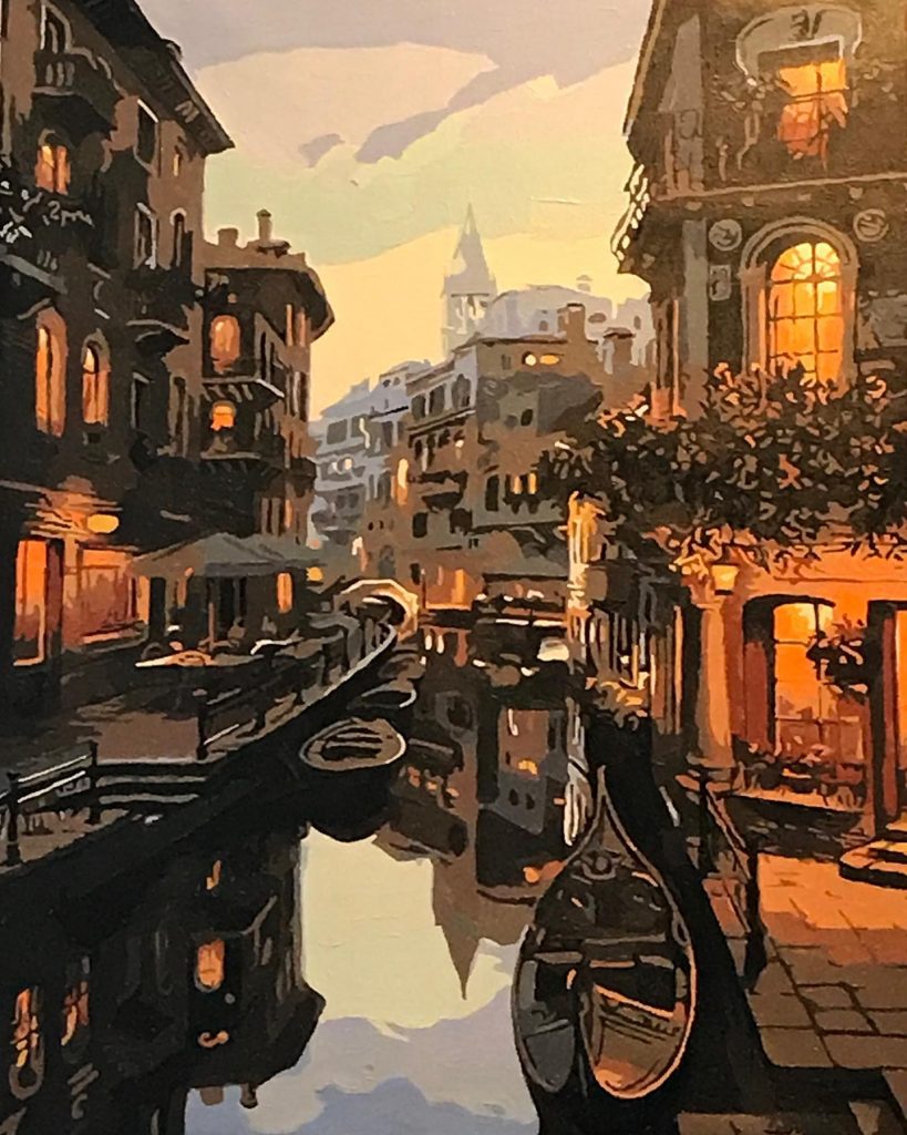
So I did another similar Italy painting to one I had done a while ago except it has more blue hues to it than the other.
Again these look much better from far away.

Comments are closed.
You really have the values (dark and light) down pat. Really nice. What do you think would make them look nice close up, too?
It’s just the type of painting. It is meant to be looked at from far away. It blends the colours together. Just funny how it does it.
Our Rembrant strikes again. Looking good Stephanie!!